Monday, December 29, 2008

Finished!!


I can't believe I finally finished the Central Park piece! The only section remaining was the central cab scene, but there was a lot of detail to be stitched.

The cabs and horses were stitched in black and white Trio, mostly in basketweave, with a little Scotch stitch variation for the horse blanket and blinders. The street lamps were worked in a satin/Scotch stitch in Kreinik #12 tapestry braid - #032 - and outlined in black floss. Finally, the reins were added with one ply of black floss.

I've added a photo of the enlargement of the original drawing (left) so you can compare it with my final needlepoint interpretation. This project was as much a learning experience for me as it was a sentimental journey. I'm pleased with my results, and hope you will be, too!

I'm looking forward to my next project--the design "Nippon Textures" by Gail Hendrix--a subject about as far removed culturally from Central Park as you can get! It also contains something I've been missing for the last six weeks of stitching--COLOR!

Friday, December 26, 2008

Trees!


Only a day after Christmas, I have two trees finished in the Central Park piece! I wanted a lot of texture in these areas to provide contrast with the sections behind and around them. So I stitched the trees in French knots using white Silk & Ivory. This thread may pack too tightly in basketweave on 18 ct. canvas, but it makes terrific, fluffy French knots.

To complete the tree on the left side of the canvas, I first had to work the section of rocks behind the tree trunk. In the original pen-and-ink drawing, the rock sections are much darker than the black-and-white foliage sections. I "test drove" any number of stitches, using different threads, to mimic the cross-hatching of the original drawing--but without much luck. I finally chose to keep the same thread as the background of the bridge--DMC #5 perle cotton--in a simple grid pattern of stitches. The fact that the black perle cotton is a true black, unlike the Felicity's Garden used in the foliage section, makes the rocks look darker. This is another situation in which I've had to replicate the overall spirit of the original art without duplicating it line-by-line.

Another larger section of rocks needs to be stitched, and then I can proceed to the finish line: stitching the two hansom cabs that provide the focus of the whole piece.

Wednesday, December 24, 2008

'Twas the night before Christmas


"and all through the house, all the menfolk were eating, except for the spouse." I'm too busy creating a black and white Christmas for me, but it won't happen yet--too much to stitch. But I thought I'd share what I did accomplish, before I exchange stocking presents with my family.

I've finished all the water and the bridge. The bridge was a tricky part to cast, because it called for varying shades to mimic shadows. Trying to stay true to the black-and-white pallette, I decided to use a needle-blending technique using cotton floss.

The background of the bridge is stitched in DMC perle cotton, so I needed six plies of floss to make the stones stand out. Depending on the intensity of the color, I used a combination of either 6/0, 5/1, 4/2 or 3/3 strands of floss in a satin stitch. I didn't maneuver the floss--I let it play out of the needle. I'm happy with the result, and as No. 2 son remarked, "It looks like a sketch." That's what I was going for!

"And I have to remark, as I fly out of sight, 'Merry Christmas to all, and to all a good night!"

Monday, December 22, 2008

Holiday decorating


The stockings won't be hung by the chimney with care for a couple of nights yet, but our holiday decorating has been done for a week or so now. Decking the living room mantel are some of my Christmas-oriented "Eggs for All Seasons," pictured here. Just wanted to assure you that I don't always think in black and white!

Saturday, December 20, 2008

Water under the bridge


The last few days I feel as though I've been stitching a sea of white! It's kind of ironic, since there are five inches of snow on the ground outside with more falling as I write. But the water under the bridge, DMC floss in basketweave, is completed under the bridge, enabling me to do some outlining in black and finishing the underside of the bridge's arch.

Also finished are the three sections of foliage stitched in Nobuko with white Trio and the white background of the bridge itself, done in basketweave using DMC perle cotton.

Next to be worked on, between baking batches of Christmas cookies, are the stones in the bridge and the black surface lines in the water.

Tuesday, December 16, 2008

Adding to the cast of characters


The section of white foliage behind the two hansom cabs, the focus of this Central Park scene, needed to be relatively unobtrusive yet provide a sheen to highlight the cabs. I cast Vineyard Silk for this role, using basketweave. It provides just enough contrast against the black-and-white foliage directly below it and the black skyscrapers directly above.

On to the bridge! For this section, I wanted a thread with a somewhat craggy appearance: something to mimic the look of stone, as well as provide further depth to the foliage behind it. I chose DMC #5 perle cotton, stitching the white of the capstone in a gobelin-over-two stitch, which makes this section stand out even further from the sections behind it. I'm stitching the white background of the bridge itself in the same perle cotton in basketweave. Then I'll go back later and fill in the individual stones.

I'm concentrating right now on getting as much of the white areas stitched as possible, so I can then go back and fill in with the black. I've finished the white Nobuko area on the right and started on the two white sections on the left side. Reaching the right side with my dominant right hand, keeping my left hand underneath the canvas, wasn't easy--my new nickname may be "Stretch"!

There's a lot of water in this piece, and I've chosen to use DMC cotton floss in a basketweave. I don't want the water to overpower the foliage and rocks in the foreground, so I'm keeping both thread and stitch deliberately simple. When I have some more of the water stitched, I'll be able to move on to those areas calling for black thread.

Saturday, December 13, 2008

Reflecting on Christmases past


In addition to being a whiz with pen and ink, my father was quite creative at building things from scratch. I recall one Christmas season, when I was about seven or eight years old, my mother was grumbling that she always put the same decorations on the living room mantel. With a twinkle in his eye, Dad disappeared into the basement.

The next day, he asked me if he could borrow a few of my dolls--just for Christmas. He begged some scraps of material and yarn from neighbors, coaxed some cotton balls from my mother--and again descended to the basement.

Three days later, he emerged triumphantly with the newest mantel decoration: a vignette of three carolers outside a shop window. The onion-skin panes of the shop's bay window were back-lit; the cotton snow hid small bulbs illuminating the front. My Davy Crockett doll had been transformed into Lord Crockett, complete with a felt greatcoat, yarn-wrapped hands, and a paper mache top hat. Anchoring the scene in one corner was a street light, also illuminated.

I celebrated this memory of Christmases past in the November 2001 issue of Needle Pointers, the magazine of the American Needlepoint Guild. My "Joy to the World," the featured cover design pictured here, added a few more "dolls" to round out the caroler family and a brick facade to the shop. I don't know whatever happened to my father's original creation, but it still lives on today, not only in my memory but also in my stitching.

Wednesday, December 10, 2008

Lights, action, scanner!


Finally, the skyline is complete! The buildings took almost five cards of Petite Very Velvet (but who's counting?). The windows are dotted with Kreinik #12 tapestry braid #032--a tiny bit of bling without a lot of glitz.

I was so excited, I moved on to another section--the white "foliage" underneath the tree on the right side of the canvas. This area needs more substance to give further depth, as I move closer to the foreground. I cast Brown Paper Packages Trio for this role. Trio is the svelte sister of Silk & Ivory and a very versatile thread on 18 ct. canvas. The stitch I've chosen is Nobuko--one of my favorites. It's a non-directional stitch and provides just enough relief to stand out from the black-and-white section behind it.

Now that I've cast that part, I'll probably move on toward the center and start filling in other roles. I already see a small problem here in this new white section: my arms are getting too short! This canvas is stapled to stretcher bars 20 inches long, and while I have long arms for someone my size, I'm not ready to swing in trees yet. So for now, anyway, I'll deal with what I can reach.

Monday, December 8, 2008

A carrot for the horse


On my fourth card of Petite Very Velvet used to stitch the skyscrapers in the Central Park canvas, I caught myself humming "It's a Long Way to Tipperary" under my breath. I promised myself I could move on to another section when that card was finished!

This next section, the largest area of "foliage" on the far right, posed a bit of a challenge in picking both threads and stitch. I'm attempting to duplicate a pen-and-ink drawing as closely as possible, but the intersections of my 18 ct. canvas are wider than the stroke of a pen. Alternating single rows of black and white stitches, both horizontally and vertically, would produce a pattern much larger than the original drawing. And this section is still pretty much in the background--I have more "foliage" and rocks as I approach the foreground which will require a larger scale of stitch. I realized I would need to balance the ratio of white to black to replicate the feel of the cross-hatching in the original drawing.

In working with many different types of thread, I have learned one fact: all silk-wool blends on the market are NOT created equal. Some, like Caron's Impressions, are so thin that you need two strands to cover an 18 ct. canvas adequately. Others, like Brown Paper Packages Silk & Ivory, are too fat in basketweave on 18 ct. canvas but a dream on 13 ct.

Rummaging through my stash, I found the "just right" thread: Felicity's Garden, in Snow and Cast-Iron Black. Starting with the white, I stitched every stitch in alternating diagonal rows, then went back and filled in the skipped rows with the black thread. I'm sure this method of alternating basketweave has a name, and I'm equally sure someone reading this post will tell me what it is!

I'm happy with the way this section turned out. It stands out from the skyscrapers, giving the canvas depth, but will recede when other sections that should be more prominent are added later. This same stitch will be repeated in a section on the far left of the canvas and in the area under the arch of the bridge.

Having treated myself with a little diversion, it's time to finish building the skyscrapers!

Friday, December 5, 2008

Auditioning Threads and Stitches


How do you adapt a two-dimensional line drawing to a three-dimensional medium like needlepoint? Simple: Add texture! And the easiest way to add texture is by choice of threads and stitches. Color, in the case of my current project, is a given: black and white. But how can you add depth with such a limited palette?

When I'm picking out threads and stitches, I like to think of myself as a casting director for a film. There are various roles to fill, some more crucial than others, but all hopefully ending in an ensemble cast. One of the crucial roles in this new project is that of the skyscrapers, which account for about one-third of the entire canvas. This is a part calling for a tried-and-true veteran: Petite Very Velvet by Rainbow Gallery, in black V601.

I have to admit, this is one of my most favorite threads. It's played a comedic role as a penguin body, modeled by Pipeline, one of the "Penguins on Parade," and the role of a heavy in the docudrama "Versailles," one of the "Eggs for All Seasons." In each part, when stitched in basketweave, this thread has achieved a seamless, stitchless performance. Just what I want in the skyscrapers--a dull, flat black that looms without overpowering the scene below.

For the sky, I chose DMC cotton floss in Blanc and #310. The horizontal lines, intersected by single diagonal rows, would play perfectly with a gobelin stitch over three threads. I could have chosen silk, but I didn't. There's a lot of sky up there, folks, and I've been told there's an economic crisis. Why buy brand when the generic will do just as well?

Those of you checking the photo from the last post may be wondering, "Why is this crazy lady stitching the black thread before the white?" I know, it goes against most of what all of us have been taught about needlepoint: always stitch the lighter colors first. But that's one of the beauties of Petite Very Velvet. It has a nice, hard bite when it wraps around the canvas, and if you catch your beginning tail of thread properly, you won't see the PVV raising its little head among the white strands later on. In fact, I've used PVV so often, I prefer the look created when the floss nestles against it. If you prefer to stitch the white first, fine! But I don't recommend switching back and forth. You will probably see a very different appearance if you vary the sequence in using the two threads.

There are many other parts yet to cast--supporting actors and "cameo" appearances--and I'll talk about them in order of appearance as they debut on the stage.

Wednesday, December 3, 2008

From paper to canvas


When I get an idea for a needlepoint design, my usual modus operandi is to sit down with a pencil and 10-squares-to-the-inch graph paper. I measure, I count, and then I count again--heck, I'm a stitch painter. Only when every square is accounted for do I actually transfer the design to canvas, each square faithfully recreated on one canvas intersection.

I quickly realized this tried-and-true method wouldn't work for my new project--my father's line drawing of Central Park. I'd need a piece of graph paper the size of Massachusetts--well, maybe Rhode Island? I happened to hold a piece of doodle canvas in front of the enlargement of the original art, and knew I had my solution--trace it! Being a black and white line drawing, the artwork showed beautifully through 18 ct. canvas.

The enlargement was 9-1/2 inches by 15 inches, so I cut a piece of blank canvas 14 inches by 20 inches. I then taped the enlargement to a piece of plywood larger than the canvas by several inches all around. I placed the canvas on top of the enlargement, lining up the outside edges so they corresponded to the vertical lines of the canvas, and taped down the canvas with masking tape. I figured--correctly--that it might take a couple of days to transfer the entire design, so I burnished the masking tape to the plywood by running the blunt end of a kitchen knife several times across the surface. I wasn't going to take the chance of the canvas shifting when I moved the plywood around.

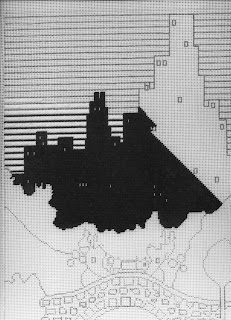
I used the kitchen counter as my work table, since it's much higher than my work table and would keep me from having to lean over for long periods. Starting at the easiest section--the skyscrapers--I carefully traced the outline with a black Sharpie (yes, Virginia, it IS permanent). When I say "trace," I don't mean in the conventional way. More accurately, I "stitch-traced." When I got to a section which didn't exactly match up to a canvas intersection, I made the decision which intersection most closely followed the design and marked it. When I sit down to stitch a painted canvas, I want to enjoy myself, not have to make countless decisions about where one color ends and the next one begins. That's why I became a stitch painter in the first place.

The only parts of the design I didn't stitch-trace were the lines in the sky. I had already determined that they were three horizontal canvas lines apart, more or less, so I drew them in that way when I'd finished transferring the rest of the design.

My resulting canvas actually looks more like a line-drawn canvas than a painted canvas. But it is all black and white, and I made another executive decision: not to fill in the solid black areas and give my poor eyeballs a break. I already knew which thread I would be using for the skyscrapers and was completely confident that the thread would cover the white canvas completely.

As is probably true of a lot of stitchers, I was "hot to trot" to start stitching--and I did! I had my first thread already in my stash, and lost no time making a beginning on this canvas. Here's my progress to date!

Next up: how to change a two-dimensional drawing into 3-D needlepoint.

Monday, December 1, 2008

What was old is new again


First of all, many thanks to all of you who posted warm words of welcome! Frequent references to "taking the plunge" I find particularly amusing, since I'm already 35 miles out into the Atlantic Ocean, stitching with the fishes!

Now to put my newest project into perspective....

The year was 1927. Calvin Coolidge was president of the U.S. Prohibition had been in place for eight years. Charles Lindbergh made the first solo non-stop trans-Atlantic flight. Commercial trans-Atlantic telephone service began between New York and London. The movie "The Jazz Singer" opened, ending the era of silent films, and "Showboat" debuted on Broadway. Ford replaced the Model T with the Model A, which sold for $385. Work on Mt. Rushmore began, and Babe Ruth hit his 60th home run.

A 20-year-old senior at New York University was named art editor of the campus magazine "The Medley." His pen-and-ink drawing of Central Park in New York City, pictured here, was used in the November 1927 issue, illustrating a rather lame joke alluding to the difficulties in finding a beverage to quench one's thirst at that time.

Flash to 2008: I'd been looking for some artwork to jazz up our newly remodeled powder room, which has accents of black and white, and remembered this drawing. The only problem was the original artwork was way too small for my purposes--approximately 4-1/2 inches by 5-1/2 inches. The only way I could see of getting the image I wanted in the size I needed was to adapt the original to needlepoint.

I took the original drawing to Staples, where a helpful clerk enlarged the piece by 210 percent. Perfect! Now the artwork measured 9-1/2 inches by 15 inches, ideal for what I had in mind. And each copy only cost 20 cents--even better!

In my next post, I'll describe how I went about transferring the design to needlepoint canvas.

And for those of you ready to scream "Copyright Infringement!" at the top of your lungs, not to worry: the young illustrator of this piece was my father, and I'm his only child.